
Some brands get the makeup world excited for a season. A few of them change it outright. ColourPop is one of the ones that changed it.
When the American brand launched in 2014, it broke nearly every convention that existed at the time. Instead of a $35 lipstick or a several-hundred-dollar eyeshadow palette, it put out innovative, colorful, high-quality products at prices that started at a few dollars.
It didn’t take long for ColourPop to become one of the most talked-about brands on YouTube, Instagram, and TikTok. Bloggers, makeup artists, and beauty lovers all over the world showed off the products again and again, and the enthusiasm around the brand was close to unprecedented.
Every trend eventually has to answer the same question, though: is ColourPop still worth the money in 2026?
I’ve spent years with a lot of these products - eyeshadow palettes, lipsticks, eyeliner pencils, Super Shock Shadows - so it’s time to update the review I wrote a few years back and sort out which pieces still earn a spot in your makeup bag and which don’t.
Why ColourPop became a phenomenon
The price alone didn’t do it. ColourPop pulled off something very few companies manage: it made a lot of us excited about makeup again.
Instead of two collections a year, the brand started launching almost monthly. Every drop felt like an event - new colors, new formulas, creative collaborations.
And it kept the prices accessible the whole time, so anyone who didn’t want to spend hundreds of dollars on makeup could still get quality and variety.
Looking back, ColourPop was one of the first brands that genuinely understood the power of social media and the beauty community.
What’s changed since my original review
Back when I wrote the first version, the excitement around ColourPop came down to two products:
- The liquid lipsticks.
- The Super Shock Shadows.
Several years on, the brand looks different. Some beloved products have been discontinued, others went through formula changes, and whole new categories showed up along the way - face products, skincare, new formulas, and increasingly elaborate collaborations.
I don’t think of ColourPop as a cheap brand with good products anymore. It’s a brand with a clear identity that isn’t afraid to innovate and experiment with formulas, colors, and design. That’s exactly why it’s still relevant more than a decade after launch.
Michal’s ranking - the Super Shock Shadows worth knowing
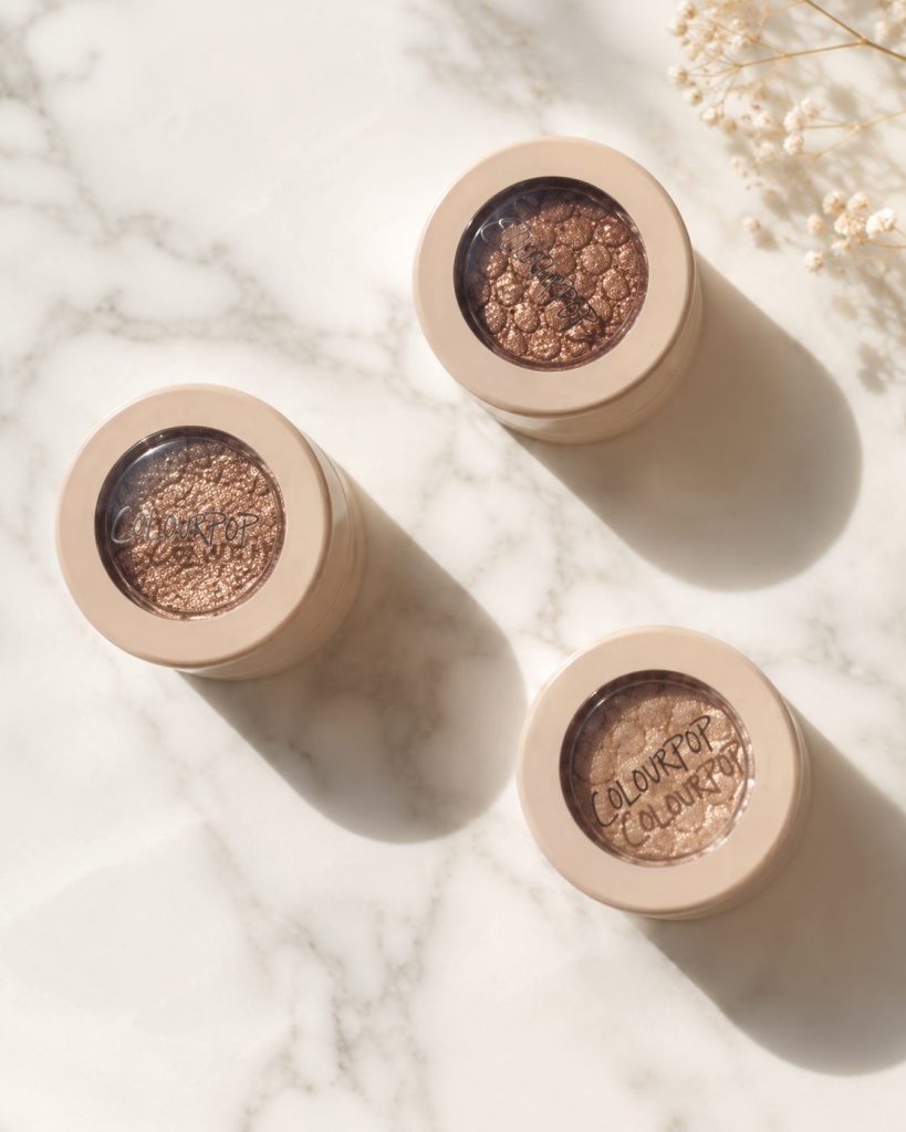
🥇 Ritz ⭐⭐⭐⭐⭐
If you’re only buying one shadow from the whole brand, buy this one. It’s a champagne-nude with a fine silver sparkle that gives the lid a wet look.
This is one of ColourPop’s most famous shadows, and that’s no accident. It works in almost any look - on its own, layered over mattes, or as an accent right in the center of the lid. It’s also one of the brand’s best-selling shades.
Who it’s for:
- Brides
- Natural makeup
- Evening makeup
- Anyone who loves elegant shimmer
🥈 Frog ⭐⭐⭐⭐⭐
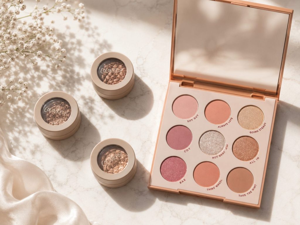
If Ritz is the champagne, Frog is the pink version - a soft silvery-pink with multidimensional shimmer that flatters almost every eye color. It’s been a ColourPop community favorite for years and it’s still a best seller.
🥉 So Quiche ⭐⭐⭐⭐⭐
One of ColourPop’s most iconic shadows: a khaki-bronze base with a fine pink-green duochrome reflection that shifts with the angle of the light. This is a shadow that gets you compliments.
⭐ Ladybird
A light champagne with fine shimmer, perfect for the center of the lid or the inner corner. It’s also beautiful layered over brown shadows.
⭐ Moonwalk
If unusual shades are your thing, Moonwalk is one of the prettiest shadows ColourPop has ever made - bronze with a greenish-gold reflection. It reminds me of MAC’s Club, if you know it.
⭐ Bae
Another classic. Deep plum-brown base, blue-purple reflection. Gorgeous for evening makeup, and a must if you love a duochrome.
⭐ Amaze
One of the brand’s most flattering champagnes - a rosy gold that works on nearly every skin tone.
⭐ DGAF
Deep golden bronze. If warm makeup is your language, this is one of the brand’s best.
Michal’s tip: New to Super Shock Shadows? Start with three shades that between them cover almost everything: Ritz for a natural, glowy look; Frog when you want something soft and romantic; So Quiche for evenings or anytime you want a little more. The three are completely different from each other, and each one shows off a different side of the Super Shock formula.
If you’re reading this review a few years after publication, some of these shades may have changed. ColourPop refreshes the Super Shock line regularly, but the formula is still one of the brand’s most successful and most distinctive.
Why I love products developed by makeup artists
What happens when professional makeup artists get involved in product development is endlessly interesting to me. Not because that automatically makes a product better, but because it usually means the product came out of a real need.
An artist working on clients day in and day out knows precisely what’s missing:
- Which shadow could stand to be more pigmented.
- Which liner could hold a few hours longer.
- Which brush could cut her working time down.
ColourPop isn’t one specific makeup artist’s brand, and it still often thinks the same way - listening to what the community is missing and moving fast. Not every launch is a hit, but a good number of these products have become genuine cult favorites.
What’s in this guide
Rather than one enormous product list, I’ve focused on what’s genuinely still worth knowing today:
- The palettes I still recommend.
- The iconic Super Shock Shadows.
- The Jelly Much line.
- The colorful eyeliner pencils.
- The lip products still worth buying.
- The new, exciting collaborations.
- My personal recommendations after years of working with the brand.
The products I wouldn’t finish an order without
ColourPop launches dozens of new products a year. Some become hits, some disappear within months, and a few have held their place in the permanent line for years - which is never an accident.
If this were my first order from the brand, or if I were rebuilding my whole makeup collection from scratch, these are the products going in the cart without a second thought.
🏆 Michal’s ranking - the products that impressed me most
🥇 1. Super Shock Shadows
No product is more identified with ColourPop than the Super Shock Shadows, and more than a decade later it’s still hard to find a formula that feels like them.
The texture sits somewhere between cream and powder - flexible, almost bouncy, delivering intense shimmer with almost no effort. It’s one of the only shadows I’d rather apply with my finger than a brush. The warmth of your finger melts it onto the lid and produces a richer, glossier finish.
I use them mostly in the center of the lid, over matte shadows, for dimension and shine without dealing with loose pigments.
Who they’re for: ✔ Anyone who loves a glowy look. ✔ Brides. ✔ Evening makeup. ✔ Beginners, because they’re genuinely hard to mess up.
🥈 2. BFF Crème Gel Liners
I have a weakness for a colorful eyeliner pencil, and ColourPop makes some of the best in the category.
The texture is very creamy, so they’re easy to work along the lash line or as a liner, and once they set they hold for hours.
The shade range is what I love most. Not just black and brown - olive green, burgundy, deep blue, purple, bronze, and some special chrome shades.
As a makeup artist, I’ll almost always reach for a colored pencil over a black eyeliner to add interest. A change that small can transform an entire look.
🥉 3. Bare Necessities
This is the palette I recommended a few years ago, and I still stand behind that recommendation today. If you’re looking for one palette that will cover nearly every purpose you have, this is one of ColourPop’s best choices.
The mix is excellent: base shades, warm browns, cool browns, shimmers, and lights. This is the palette you throw in a suitcase and get through a full week with.
Why I love it: versatility. Not because it holds 30 shades, but because almost every shade in it is genuinely usable.
⭐ 4. Jelly Much Shadows
If Super Shock was ColourPop’s first revolution, Jelly Much is the natural sequel. These are gel-cream shadows that give the kind of wet, glowy effect a powder shadow can’t touch.
I use them when I want dramatic shine on the lid fast. One thin layer with a finger is enough for a rich, striking look.
Worth knowing: like any gel product, close the cap tightly every time or the formula dries out.
⭐ 5. Stone Cold Fox
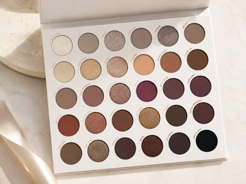
Bare Necessities is the queen of warm shades; Stone Cold Fox is the queen of cool ones. It’s one of ColourPop’s prettiest palettes, full of taupes, grays, cool browns, and champagnes, which makes it perfect if warm-toned makeup isn’t your thing.
I recommend it constantly to anyone who loves elegant, classic makeup.
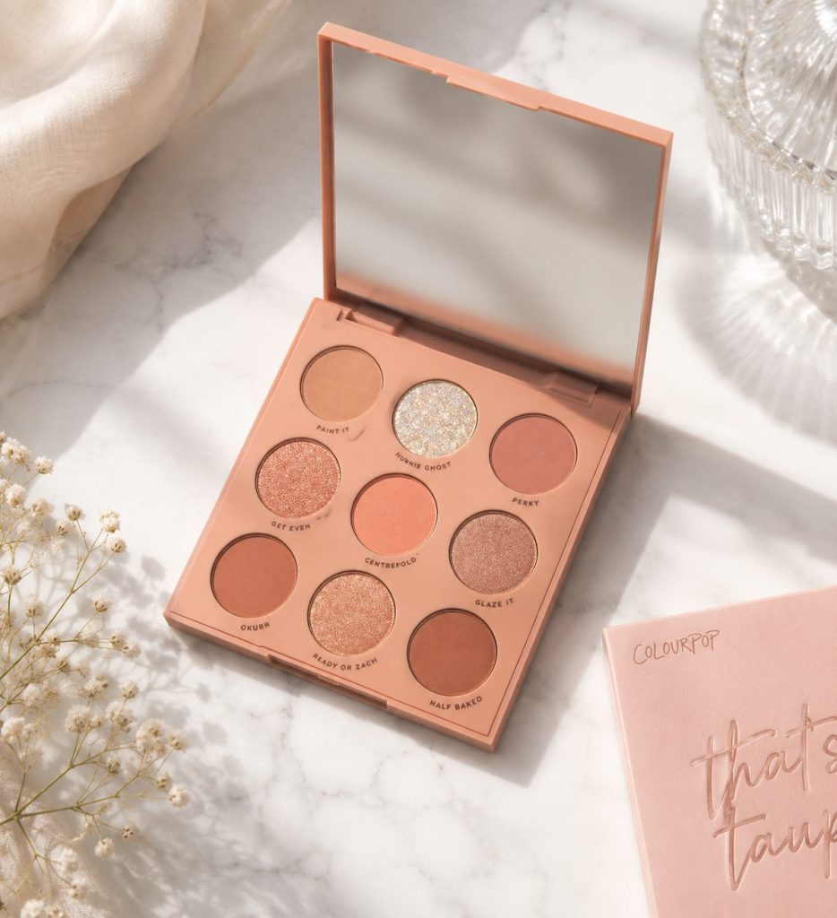
⭐ 6. That’s Taupe
Not ColourPop’s most famous palette, but one of its most useful. A small palette often does far more work than a giant one.
The shades blend beautifully into each other, and it’s ideal if you like a soft, natural look. If taupes and cool browns are your thing, this one is hard to be disappointed by.
Michal’s tip: The most common mistake I see is trying to buy every new ColourPop launch. Build the collection deliberately instead. For a first order, I’d get one eyeshadow palette, one Super Shock Shadow, and one BFF Crème Gel Liner in a shade you love. Those three will show you everything the brand does best.
The products I’d be slower to buy
This may be a slightly less popular opinion, but I don’t think every ColourPop product is automatically a must-have - especially not from a brand that launches dozens of new products every single year.
The real strength here, in my opinion, is eye products. In categories like foundation, concealer, and powder, the competition today is fierce, and I wouldn’t automatically pick ColourPop when there are so many excellent alternatives sitting on the market next to it.
That’s obviously a personal preference. But if the budget is limited, I’d put the money into the products that made this brand what it is in the first place.
ColourPop’s eyeshadow palettes - which one is yours?
Nothing is more identified with ColourPop than its enormous range of eyeshadow palettes. On one hand, that range is a big part of the brand’s charm. On the other, it’s exactly how you end up lost among dozens of launches, collections, and limited editions.
I’ve tried a good number of them over the years, and I’ve come to the conclusion that there’s no such thing as the single best palette. It comes down entirely to the kind of makeup you love, so I’ve sorted my recommendations by style instead.
🤎 If you want one palette that does it all - Bare Necessities
Still the easiest palette in the range to recommend. The mix of light and dark, warm and cool, matte and shimmer lets you build almost anything - everyday natural makeup through a full smoky evening eye.
It works for a total beginner and for a professional makeup artist who wants a solid base palette in the kit.
Why I love it: ✔ A huge shade range. ✔ A smart matte-and-shimmer mix. ✔ Excellent value. ✔ Works on nearly every skin tone.
🤍 If you love cool shades - Stone Cold Fox
Back when almost every palette leaned warm, Stone Cold Fox gave taupes, grays, and cool browns a place of honor.
The elegance is what gets me. It doesn’t shout, it’s just pretty. Soft bridal makeup, something office-appropriate, a more dramatic evening eye - it does all of it. This is the palette I recommend most to anyone who doesn’t get along with an orange undertone.
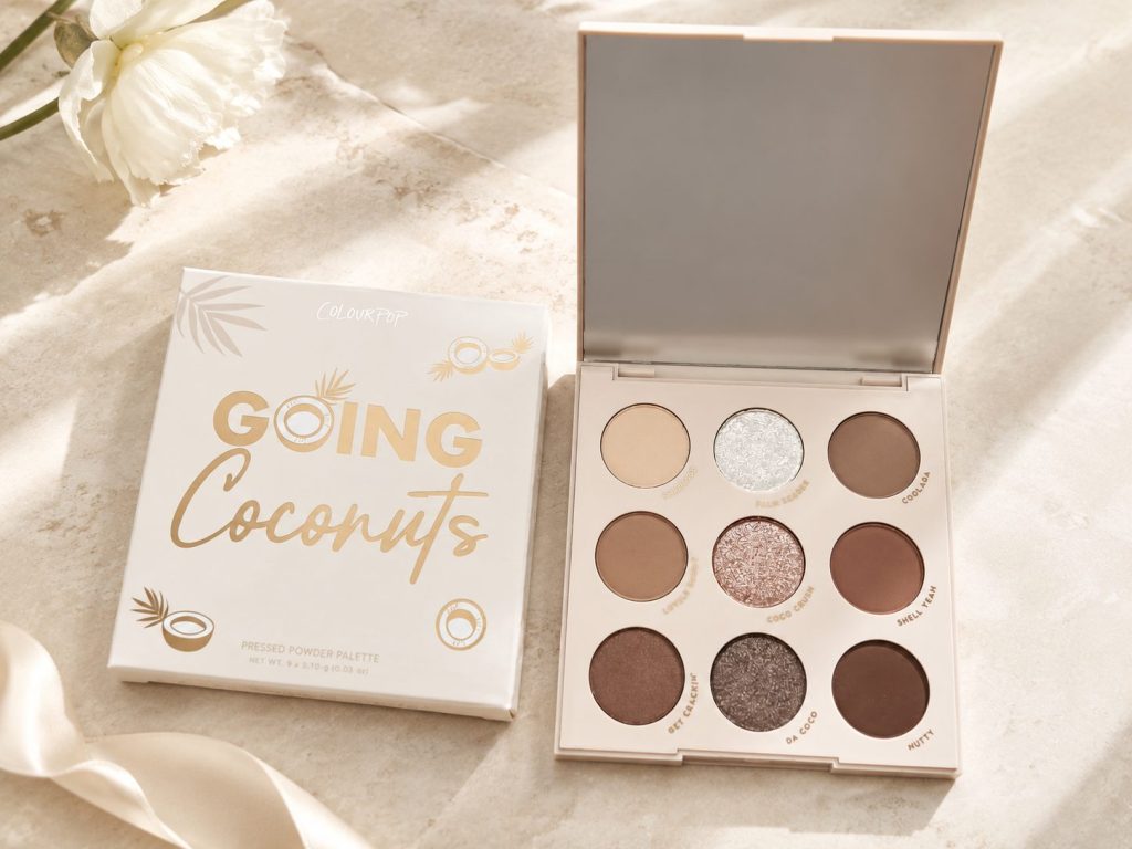
🤍 If you love a natural look - Going Coconuts
Don’t let the size fool you. This is one of ColourPop’s most useful palettes. Every shade blends naturally, and there’s barely a color in it I couldn’t use. It’s the palette you take on vacation and use exclusively for days.
🤎 If you love taupes - That’s Taupe
One of ColourPop’s most elegant palettes. No loud colors, no excess glitter, just sophisticated shades that suit almost any look. It’s especially good for anyone after mature, classic, timeless makeup.
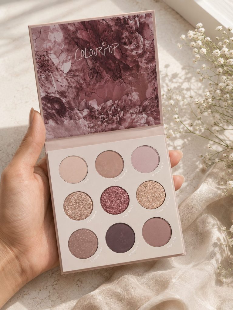
💗 If you love pinks and mauves - Making Mauves
One of the palettes I most enjoy working with. Smoky pinks, delicate mauves, and touches of purple that build a soft, romantic look. It would also be a wonderful choice for a bride who wants something delicate and not too warm.
🌈 If you love color - Fade Into Hue
Not a palette for everyone. But if you like experimenting with color, it’s one of ColourPop’s most impressive. Nearly every color you could ask for, in a mix of mattes and shimmers that opens up endless creative looks. It’s also a great pick for makeup artists expanding the color range in their kit.
🌸 Palettes still worth knowing
Not at the top of my bestseller list, but still worth a look:
🌷 Blush Crush
Soft pinks in the spirit of the romantic trend of the last few years. Ideal if you love a delicate, feminine look.
🍑 Baby Got Peach
If warm peach tones are your thing, this is one of the brand’s prettiest palettes. It builds fresh looks made for spring and summer.
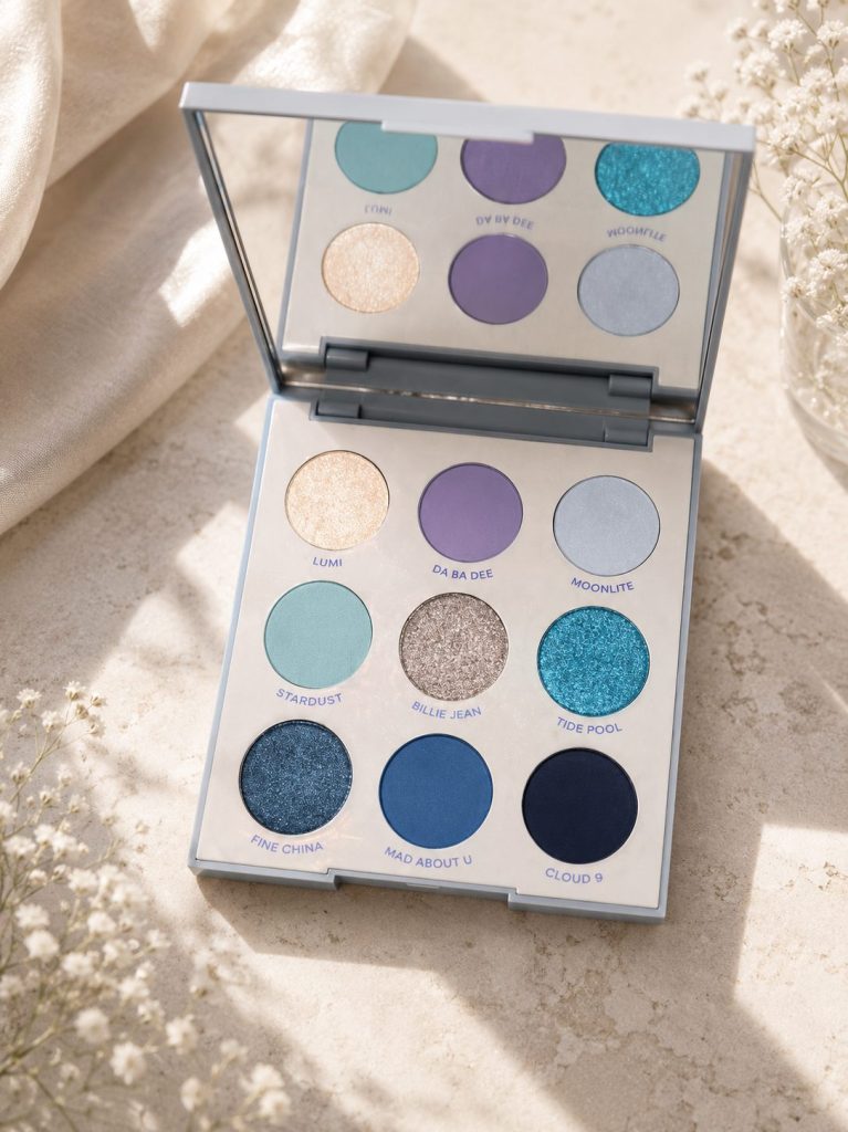
💙 Blue Moon
Good blue palettes are hard to find. If you like working with blues, this is still one of ColourPop’s more interesting options.
Michal’s tip: “Which palette should I buy first?” My answer barely changes: don’t look for the palette with the most colors, look for the one you’ll actually use. A nine-shade palette that fits you beats a thirty-shade palette you only use five shades from. The small, simple palettes are usually the ones that stay out on the vanity day after day.
My personal picks
Three palettes out of ColourPop’s entire range, and these are the three:
- 🥇 Bare Necessities - the brand’s most versatile palette.
- 🥈 Stone Cold Fox - for cool, elegant shades.
- 🥉 Going Coconuts - compact, perfect for everyday.
They complement each other, and together they cover almost any makeup style.
Michal’s tip for makeup artists: If you’re working professionally, don’t choose palettes purely off what’s trending. It matters far more to build a kit where the palettes complement each other in shade and in finish. Do that and you can create a huge range of looks without hauling dozens of different palettes to every job.
The collaborations that made ColourPop one of the most creative brands in makeup
The collaborations are what separate ColourPop from almost every other brand.
Where most brands manage one or two seasonal collections a year, ColourPop keeps landing collabs that play like a party for beauty and pop-culture fans at once.
What I love most is that they rarely stop at pretty packaging. Real thought usually goes into the shade selection, so the colors carry the mood and the characters the collection came from. A few of my favorites.
🚀 Toy Story x ColourPop
I grew up on Pixar movies, so staying neutral about the Toy Story collection was never going to happen. ColourPop took the colorful world of Woody, Buzz, Jessie, and the rest and turned it into a palette that’s both colorful and actually usable.
The part I loved: it isn’t all bold shades. Alongside the greens, blues, and yellows from the film, there are neutrals you’d wear on a normal Tuesday. That’s the kind of collection that looks great on the shelf and still gets used.
⚡ Pokémon x ColourPop
One of the most elaborate collections the brand has launched in years. Rather than defaulting to Pikachu, ColourPop built the collection around Eevee and all of its evolutions.
The result is a colorful palette that pairs natural shades with playful ones. Even if Pokémon means nothing to you, the thought in the color choices and the packaging is impressive.
🎤 Hannah Montana
Probably the year’s most nostalgic collection. ColourPop marked 20 years of Hannah Montana with something that reads like a love letter to anyone who grew up on the show.
The Best of Both Worlds palette splits in two - one half in natural shades for Miley Stewart, the other more colorful and glowy for Hannah Montana. Small idea, and it tells you how much attention went into the details.
👑 Disney Princess
The collection that keeps coming back in new versions. Every princess gets a palette built on her personality.
Belle pairs golds with warm browns. Ariel gets turquoises and purples. Snow White leans red and gold. Not every version stays in stock long, and every one of them creates a frenzy.
🍯 Winnie the Pooh
Probably the cutest collection the brand has ever made, and it isn’t the wall of yellow you’d expect. It’s a lovely mix of honey tones, warm browns, soft greens, and golds that are genuinely wearable. Nostalgic and elegant at the same time.
🌙 Twilight
The collection that broke the internet. ColourPop caught the Twilight nostalgia wave and put out something that sold out almost immediately.
The shades are darker and more dramatic - burgundy, grays, cool shimmers, exactly the mood of the films. You don’t have to have loved the series to find plenty of pretty colors here.
🧙 Harry Potter
One of the most anticipated launches. ColourPop built products around the wizarding world in colors that carry the Hogwarts mood. The packaging was especially impressive, and again, the thinking clearly went past the design.
Why ColourPop’s collaborations work so well
The answer is simple: ColourPop doesn’t print a character on a box and call it a collection. They tell a story.
The shades, the shadow names, the packaging, and even the textures get chosen to fit the world the inspiration came from. That’s why people who don’t collect makeup at all still find themselves tempted by a collection purely for the emotional pull.
Michal’s tip: I’m drawn to these collaborations too, I’ll admit it. But before anything goes in my cart I ask one question: would I buy this palette in plain white packaging? If yes, it’s probably worth the money. If no, then it’s the box selling me, not the makeup. What matters is the quality of the formula and whether the shades will actually work with the rest of my collection.


